Plotly Exploration#
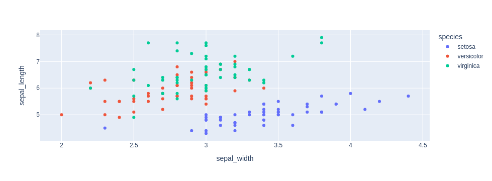
Scatter Plot#
https://plotly.com/python/line-and-scatter/
[2]:
import plotly.express as px
df = px.data.iris()
fig = px.scatter(df, x="sepal_width", y="sepal_length", color="species")
fig.show()
[36]:
import plotly.graph_objects as go

import pandas as pd
from datetime import datetime

df = pd.read_csv('https://raw.githubusercontent.com/plotly/datasets/master/finance-charts-apple.csv')
df.head(3)
[36]:
| Date | AAPL.Open | AAPL.High | AAPL.Low | AAPL.Close | AAPL.Volume | AAPL.Adjusted | dn | mavg | up | direction | |
|---|---|---|---|---|---|---|---|---|---|---|---|
| 0 | 2015-02-17 | 127.489998 | 128.880005 | 126.919998 | 127.830002 | 63152400 | 122.905254 | 106.741052 | 117.927667 | 129.114281 | Increasing |
| 1 | 2015-02-18 | 127.629997 | 128.779999 | 127.449997 | 128.720001 | 44891700 | 123.760965 | 107.842423 | 118.940333 | 130.038244 | Increasing |
| 2 | 2015-02-19 | 128.479996 | 129.029999 | 128.330002 | 128.449997 | 37362400 | 123.501363 | 108.894245 | 119.889167 | 130.884089 | Decreasing |
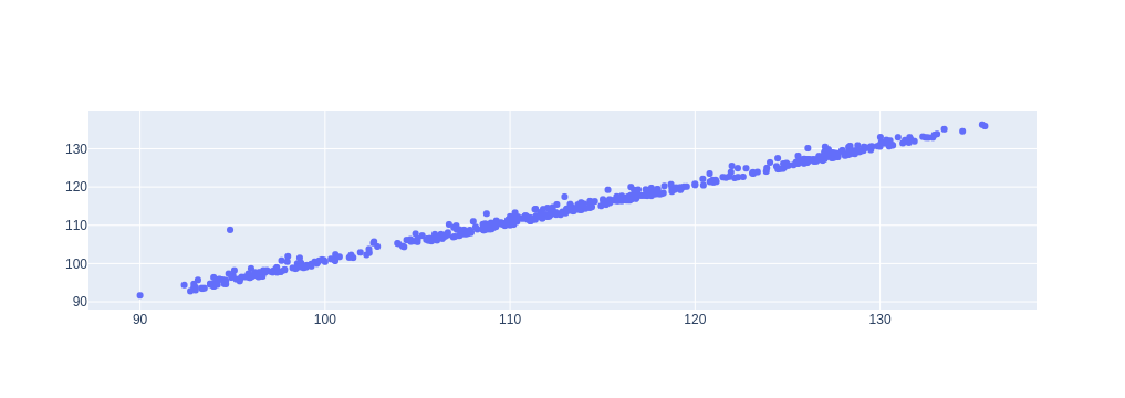
[59]:
fig = go.Figure(data=go.Scatter(x=df['AAPL.Open'], y=df['AAPL.High'], mode='markers'))
fig.show()
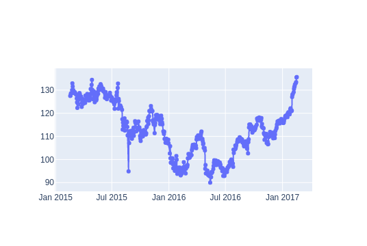
Line Plot#
https://plotly.com/python/line-and-scatter/
[38]:
fig = go.Figure(data=go.Scatter(x=df['Date'], y=df['AAPL.Open'],
                                mode='lines+markers'))

fig.show()
[39]:
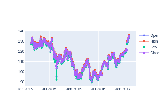
fig = go.Figure()

# Add traces
fig.add_trace(go.Scatter(x=df['Date'], y=df['AAPL.Open'],
                         mode='lines+markers', name='Open'))
fig.add_trace(go.Scatter(x=df['Date'], y=df['AAPL.High'],
                         mode='lines+markers', name='High'))
fig.add_trace(go.Scatter(x=df['Date'], y=df['AAPL.Low'],
                         mode='lines+markers', name='Low'))
fig.add_trace(go.Scatter(x=df['Date'], y=df['AAPL.Close'],
                         mode='lines+markers', name='Close'))
fig.show()
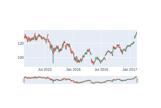
CandleStick Plot#
https://plotly.com/python/candlestick-charts/
The candlestick chart is a style of financial chart describing open, high, low and close for a given x coordinate (most likely time). The boxes represent the spread between the open and close values and the lines represent the spread between the low and high values. Sample points where the close value is higher (lower) then the open value are called increasing (decreasing). By default, increasing candles are drawn in green whereas decreasing are drawn in red.
           ___
High-->     |
            |      ]--> Upper Shadow
Open-->   __|__
         |     |
         |     |
         |     |   ]--> Real Body
         |     |
Close--> |_____|
            |
            |      ]--> Lower Shadow
 Low-->    _|_
[40]:
fig = go.Figure(data=[go.Candlestick(x=df['Date'], open=df['AAPL.Open'], high=df['AAPL.High'],
                low=df['AAPL.Low'], close=df['AAPL.Close'])])

fig.show()
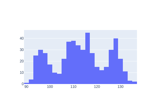
Histogram Plot#
https://plotly.com/python/histograms/
[41]:
fig = go.Figure(data=go.Histogram(x=df['AAPL.Open']))
fig.show()
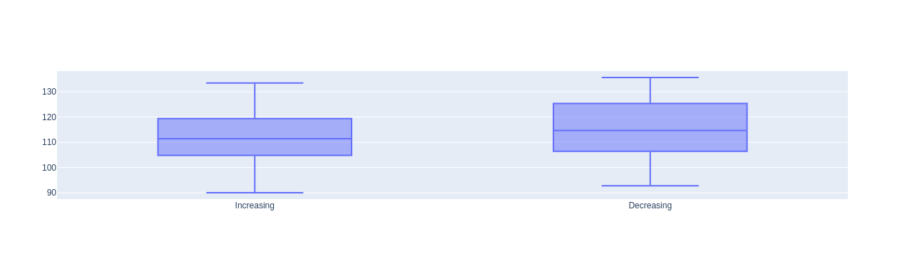
Box Plot#
https://plotly.com/python/box-plots/
[42]:
fig = go.Figure(data=go.Box(x= df['direction'], y=df['AAPL.Open']))
fig.show()